Monday, December 10, 2018

You've Got to be Kitten Me: The Logic of Fonts


As I absentmindedly perused my social media feed (a typical Sund... every day (who am I kidding?) routine), I came across the cutest post entitled "Cats as Fonts." As if this post were after my very heartstrings, I scrolled through the adorable pictures of kittens dressed ridiculously to embody the attitude around common types or fonts. For the average person, fonts are only knowingly interacted with through a Microsoft Office product lens. Academic papers and reports are written in Times New Roman. Sensible emails are sent in Arial or Tahoma. All Microsoft Office applications default to Calibri. And that seems to be okay, as the average person is more focused on their message--what it is they want to convey--than how that message is presented. But unknowingly, we directly encounter fonts everywhere, in ways we'd never imagine.
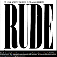

Since the 1940s, the significance of font has been debated and engendered for the purpose of advertising. An obsession formed around how the look of a thing could influence people, and make them say… want to buy a product. As time marched ahead, in the interest of technology and progress, consumerism became less about selling a single product and more about selling an idea. Brand recognition and product loyalty are what companies are after today, and they are using visual imagery to draw us in. Advertisers are also thinking about what fonts to use.

Gary Hustwit created a two hour documentary about the history, future, and nuances of the font he termed “ubiquitous,” Helvetica. The personification assigned to these fonts is interesting in the sense that--behind certain closed doors--a power to express attitudes through fonts that the unconscionable reader does not recognize is being manipulated. If fonts are the nonverbal communication of written text, just what are they saying?

Ted Hunt, in an article posted on The Daily Egg, talks about the psychology behind choosing typeface in order to solicit a certain emotional or psychological reaction from an audience. He says in his article,

“You should take careful consideration when choosing a logo font. As you may already know, people have certain feelings, emotions, and associations when they see certain colors. What you may not realize is that they have a similar response to typefaces and fonts.”

The article then goes on to explain the perceptions of several of the more successful font styles in advertising (seen below);


Ted Hunt in "A Pro Designer Shares the Psychology of Font Choices"

It is interesting to see how something so easily taken for granted by one group of people is a highly prioritized consideration for another group of people. Remember that the next time you’re writing a persuasive argument for a class or when you’re constructing an email to ask your boss for a raise. It’s not just the content of your message that might help sell your point. Oh yeah, about those cats...


Tuesday, December 4, 2018

It's So Hard to Say Goodbye


Tonight's class was bittersweet. Although I've been longing for the end since about midterms, seeing everyone's presentations, how comfortable we all were standing in front of each other, how supportive we all were of each other made me realize that we'd grown into a mini family. Facebook updates, chats after class and during breaks, I realized--as I suspected from the first night of class--that we are a special group.

I appreciate now even more the storytelling lens that themed our course. It allowed us to embrace the human connectivity that Hannah Gadsby talked about in her special Nanette or what Andrew Blubaugh tried to rediscover after being attacked as he shared in his independent documentary, Scaredycat. All the digital media materials were one of the highlights of this course to me. I loved the use of different mediums to convey the idea of process, a principle of technical writing. 


The writing assignments were reflective and analytical. They were a nice accompaniment to the thought-provoking and sometimes controversial (Thanks Steven Katz) articles. I loved Geoffrey Sirc's "Box Logic" and how we were able to see from his art of deconstructing and compartmentalizing his thoughts, and in some ways his very life, the way we are asked to take a process apart in order to to make it accessible to TW audiences.

Logic Box


Hannah Gadsby (Nanette)

Most of all, I like how this class made technical writing a creative and inspiring process instead of a daunting and intimidating one. Bonnie Kyburz, with all of her dramatic flair, eccentricity, and French overtures infused all of herself into the course--her past experiences working in digital humanities and in the arts (particularly within the genre of film), her personal life, her inspirations, her connections to and within the capacious (thank you for my newest lexical addition) technical writing field. She laid all her cards on the table and she had a full house.

I want to wish you all great luck on your remaining projects (unless you're finished like me), a happy and recuperative holiday, and a successful spring semester if I don't see you again. In the words of Hannah, you all are "mu peoples."

Tuesday, November 27, 2018

To Eat or Not to Eat: Restaurant Redesign Project Reflection


For our restaurant redesign project, my group chose DeKalb staple, Yen Ching. The process of making recommendations was a task itself, but I have to start with the fact that I actually got to go out and eat as a class assignment. First. Time. Ever. And I loved it! Okay, back to the assignment at hand (pun intended).

I had personally never been and and felt that going at 11:30a, when the restaurant opened, would be the best way to experience the freshest food offerings. There was not a lot of parking on the side as a majority of the spaces are located in the back of the restaurant. The parking lines were also worn out making it difficult to distinguish where or how to situate our cars--especially to avoid potentially obstructing the handicap space.

There are beautiful, dramatic over-sized red doors... that are no longer used, which was disappointing. Once inside, there was a hostess station, but no hostess. The restaurant was large and open, but the lighting was so dim, not only did it hide the culturally thematic decor of the restaurant, it seemed dark, moody, and almost depressing. We were greeted and served by one of the owners, Marilyn Yin, which was a great personal touch. The walls were covered with large, traditional Chinese art and huge warrior statues stood in place around the interior. Large, Asian-fabric booths created the perimeter and family-sized round tables (some complete with lazy Susans) occupied the middle of the restaurant.


Yen Ching’s menu had many different and bold colors and was really busy. It became overwhelming to make a decision regarding what to eat. Another disappointment was the small amount of vegetarian offerings (with no vegan offerings) at the restaurant. There was not even an alternative soup option to select with your entree, which I found odd considering they make a vegetable-based soup (I asked). 


The food offering was tasty, and came in a large portion, which is definitely a plus in my book for Yen Ching. Each entree came with a soup appetizer and a side of wontons (although they forgot my wontons), and tea was complimentary. My meal came out quick, hot, and fresh. I ordered the vegetable fried rice (pictured above). The mixed vegetable included cabbage, broccoli, onion and snow peas. It was delicious, and the serving was large enough for me to eat sufficiently there and take a meal-sized portion home.

Below are a few additional points that stuck out to me:
Chlorine smell in entryway- indicates clean practices, but overwhelming and uninviting smell right before sitting down to eat is off putting. Less harsh, more organic and eco-friendly products would reduce harsh smell. Also, by using potpourri, eucalyptus/ etc., the restaurant could actually offer customers a mild, fragrant and inviting welcome. (note: we arrived as soon as the restaurant opened, and the smell had dissipated by the time we left.)

Picture collage- picture collage hangs on the wall of individual loose pictures hung with (likely) tape. Collage seems bulky on wall and looks unkempt, unprofessional, and unsanitary for a restaurant setting. A larger frame which could accommodate the photos (or even individual frames placed throughout the restaurant) would give a sleeker, more professional presentation.

Money loosely hanging- similar to pictures, loose money was hanging from the wall. Access paper easily collects dirt. Money not only looks unprofessional, it is a potential environmental hazard. If money is representative of certain customers or financial milestones, a cleaner (both environmentally and aesthetically) would be to frame them.

Slightly chilled inside- restaurant is large and open, and thus drafty on the inside. Thicker seals at the entry doors, or even column heaters, could fix this minor issue without sacrificing the aesthetic in the restaurant.


Overall, I was satisfied with my experience and above all, the food was delicious (which is the number one thing I expect from restaurants). I would definitely consider eating there again, though predominately through takeout (unless i had a hot date where that mood lighting would actually be appropriate). 


Tuesday, November 20, 2018

Happy Thanksgiving (Pass the Technical Writing Please)


I never quite thought about how much technical writing was a part of my everyday life until this course. The idea of process, the how-to, DIY, "Google it" or "Youtube it" generation that we have become gives us instant access at our fingertips--with the added bonus of choice to select exactly how much or little detail we want along with our instructions and/or what visual medium we'd prefer in our experience with said instructions. Tom Johnson, in his 2009 blog post "A Microcosm of Technical Writing in the Kitchen while Cooking a Banana Cream Pie," puts back in perspective the importance of technical writers thinking the entire way through the process as well as the consideration needed for formatting their technical writing with a particular audience in mind (or crafting it for universal use).


Johnson's quip-filled post about his journey through making a banana cream pie as a baking novice using instructions from his friend, a cooking virtuoso, plays nicely as an allegory for how technical writing puts documents together making graphic, typographic, and vernacular choices that affect the way readers interpret the text. In one his examples, Johnson asserts,

 For example, try to make sense of this step:
Stir a small quantity of the hot mixture into the beaten egg yolks, and immediately add egg yolk mixture to the rest of the hot mixture.
This does not make sense to me. Pour A into B, and B into A? No reason given for this. Just do it. Why not simply pour A into B or B into A, rather than doing a little of both at nearly the same time?
Jane explained that this back-and-forth pouring of the hot custard would bring the egg yolks up to a warmer temperature slowly without causing the eggs to curdle. Oh, I said. Now I see, but that connecting logic was simply assumed in the instructions.

Though humorous and easily dismissive as a proclivity to overthink, Johnson makes a poignant point about the comparison of a recipe (which is in itself technical writing) and the classic dilemma of technical writers. How much is too much? What technical aids will support multiple comprehension styles? What are the knowledge limitations of my audience? It's a slice of pie... humble pie.

Comment with some ambiguous recipes you've seen and try not to eat too much. Happy Thanksgiving all.


Tuesday, November 13, 2018

When Writing Goes Wrong: Stacey Pigg and the Incorrigible Journey of Reinventing the Wheel


Stacey Pigg's Article "Coordinating Constant Invention: Social Media's Role in Distributed Work" outlines the idea that the workplace isn't what it used to be and works hard(er than it has to in my opinion) to centralize social media as a phenomenon that connects, informs, markets and how this trifecta is being used by technical and freelance writers to leverage bigger and better professional opportunities. Pigg defines these "symbolic workers" as "professional communicators whose work is symbolic-analytic often face a dual burden: composing an immediate time and space to conduct their work and overcoming a long-term lack of stability related to future professional opportunities. Her identification of a rising issue in the professional sphere and his research to provide nomenclature around the distribution of work and how it effects writers' roles as social coordinators was interesting and relatively well-stated. The issue I had was with the seeming structural issues this article suffers from that made reading a pure drag.

Over-worded and Dramatic:

Because the the multiple components of work life are being compartmentalized instead of exploring the fluidity of the intersections as Kirk St. Amant does in his definition of distributed work as the “coordinative, polycontextual, crossdisciplinary work that splices together divergent work activities.” The article also presupposes that the idea of integrated communication networks are not currently being valued by companies and corporations today and using fallacious arguments (for example that companies banning employees from accessing social media sites is equal to companies not understanding the power social media can play in business processes).

Too Many Topical Shifts:

Pigg begins her article by challenging the idea of a workplace as physical location to set the stage for his argument about the increasing validity of nontraditional and virtual spaces as credible work spaces. She then transitions--not so seamlessly--to ideas about the degrees of communication that are becoming critical for their tacit role in informing writers. Methods of communication relegated as personal, social applications for interaction are "today, non-hierarchical model[s] of exchange," like in her reference to digital lists of friends as concretized relationships.


The Issue of Revamping the Old into the New:


Pigg presents the information as if social media founded an entirely new principle of corporate relationships. The concept of network building did not begin with social media, it merely pivoted. It was hard to truly invest in this article when every other sentence I thought, ‘duh’ or ‘that’s how work has always been.’ A more worthwhile angle might have been social media’s role in the evolution of the idea of the workplace or a work space.

                          What about sales?

                              What about marketing?

For Pete’s sake, the entire idea of the assembly line is distributed work and Henry Ford was using this concept for almost 100 years. If you replace “social media” with “globalization” within Pigg's article, this same argument was happening 50 years ago. Heck replace social media with coal, and people were saying the same thing at the start of the industrial revolution. And yet this piece marched on…

Pigg did eventually get to making a poignant point about how social media was being used to leverage employment marketability and the process that one blogger undertakes to gain success (at which point I thought, You should have just started here). But it also made me question—again—what the actual topic of this article was. 

Overall, I found the article shifty, wordy, and slightly unsure of itself like that girl at the prom who, despite her parents assuring her how beautiful her gown was, or how shiny and modern her limousine, or how many of her friends complimented her, still felt awkward. That is what reading this article was like for me; like observing someone who had all the right elements that somehow did not fit together.


P.S. Social coordination is not mutually exclusive to social media.

Monday, November 5, 2018

St. Amant: Cognition, Recognition and Visual Design Key Webinar Notes


Interaction/ Feedback Approach: personal process for understanding human feedback


Visual feedback*


Effective Communication


* How the mind processes visual design
-        
            -   Facial recognition
-          -  Body language

Configuration: how the above mentioned process is applied to inanimate objects


Trial and error: “Visual models that guide behavior looking for visual feedback in terms of cues that indicate what I what done was done correctly or not until there is an effective visual mental model” (11:34 to 11:57)


Feedback/input communicates the communication was successful

Attention (What gains attention?)
Comprehension (what ensures comprehension?)
The need for paratextual information in the use of symbolic communication (the attention/ comprehension gap)
Moving beyond the descriptive to the process of coordinating information in technical writing (I knew Pigg could have said it easier). The decision to use symbols over words as text (relativity)
Identification: The normalization of symbols as universal text. 

*Analogous- making new things look like old things so individuals can easily transfer stored mental models.
How visuals influence daily life:
* Perception: the interpretation of visual cues (especially in the face of lack of contextual information).
  •          Practical design
  •      Works with incomplete information to let mental models fill in the blanks (Gestalt theory)
  •      Orients the mind for how to comprehend information: how to show the viewer what to look at by drawing their attention to specific visual cues (warshack)


 Evaluation: is the visual depiction effective?

Affirmation: the credibility of the design.


You've Got to be Kitten Me: The Logic of Fonts

As I absentmindedly perused my social media feed (a typical Sund... every day (who am I kidding?) routine), I came across the ...